
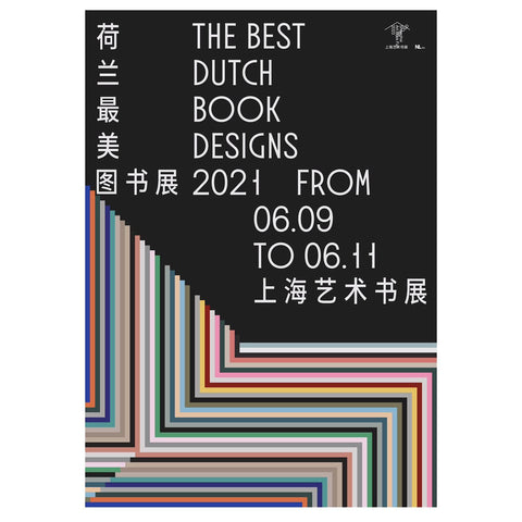
The Best Dutch Book Designs 2021 in Groningen & Shanghai
As we speak, The Best Dutch Book Designs 2021 are on display in an exhibition at the Shanghai Art Book Fair 2023! Our publication Rollable Ramblings. Koen Taselaar is part of this special exhibition. Published by Jap Sam Books, initiated by Block C Groningen, design by Team Thursday, and Printed by Zwaan Lenoir.
Closer to home, right now the selected publications are also on display at GRID Groningen until July 2nd, 2023. Every Saturday while the exhibition runs there will be a special event. Coming weekend they kick off with a talk by Michiel Teeuw (artist, designer, and journalist) and Kuan-Ting Chen, creator of Met Stoelen, one of the selected publications. After this, bookbinding workshops and a zine making workshop will take place at the location of the exhibition, free entry.

Images by The Book Photographer
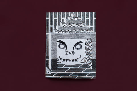
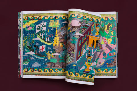
Below you can find a beautiful series of images made by The Book Photographer of the prize winning publication Rollable Ramblings. Koen Taselaar. The images capture all of the beautiful details of this greatly designed book, by the designers of Team Thursday.
The publication features a screen printed cover, a Japanese bind, and the multiple different kind of papers that are used amplify all that is printed on them. Koen Taselaar. Rollable Ramblings shows reproductions and zoom-ins of the tapestries made by the artist complimented with essays by Katalin Herzog. The images are colorful and super detailed, you can see every thread that went into the tapestries. The black and white design works great in contrast with the bright colors of the tapestries. The Japanese bind makes it possible for images to continue on multiple pages as well as hiding black and white details of tapestries and titles on the inside of the pages. Glossy paper for the bright images and a soft, slightly translucent paper for the text pages and title pages where the black and white images shine through from the inside out.


Images by The Book Photographer
Order Rollable Ramblings. Koen Taselaar >>>
-
Ronja Driessen
